
The new Claude charts.
(yet another Claude upgrade)

Claude is launching a new feature every single day.
But I cover only the ones that matter.
And this one does matter: create interactive charts, right inside your chats.
Save this guide to try all of the copy-paste prompts this weekend.
Send it to your team’s Slack or Teams channel to get them on board.
How to create an interactive chart.
Go to claude.ai, the regular chat version.
Start your prompt with “Create an interactive chart about […]”.
Here’s a quick example. I love the board game Catan. Let’s visualize it:
Prompt:
Create an interactive chart on game theory in Catan.The result:
Example #1. How much money to invest?
It’s the classic example of “How much money on the S&P 500 to stop working?”
Prompt:
Create an interactive chart of how much total money I need invested in the S&P 500 (dividends reinvested) to generate $50,000/month safe withdrawal ($600k/year initial, with withdrawals adjusted every year for inflation), considering:

1. inflation / cost of living + money/currency devaluation / purchasing power erosion (pessimistic/optimistic scenarios)

2. historical and forward-looking S&P 500 total return performance (dividends reinvested, pessimistic/optimistic scenarios)

Don’t code. Interactive chart only.
The result:
💡 Pro tip: Sometimes you need to force the Chart mode by prompting “Don’t code. Interactive chart only.” The good news is that it works every single time.
Example #2. Understand the exponential.
Prompt:
Create an interactive chart on the exponential curves of AI.The result:
💡 Pro tip: You can ask Claude to first gather information by deeply searching the web / finding consensus. And then ask for the interactive chart.
Example #3. Learn chess, with interactions.
Prompt:
Interactive chart on how to master the 20% of chess for a complete rookie (that gives you 80% of what you must master).Result:
💡 Pro tip: Keep asking for more tactics. I couldn’t find the end of it. Sure, some specialized websites (like chess.com) are much better than Claude to teach you chess. But until when? Claude is 3 years old. What about Claude in 3 years?
If I were Duolingo, for example, I’d be scared. And I think it shows on their stock:
How to share it with others.
You just made the best interactive chart.

Now, you need to share it.
How to share it with your team
Read my guide on running Claude as a team.
Click on the top right “Share” and select “workspace”.
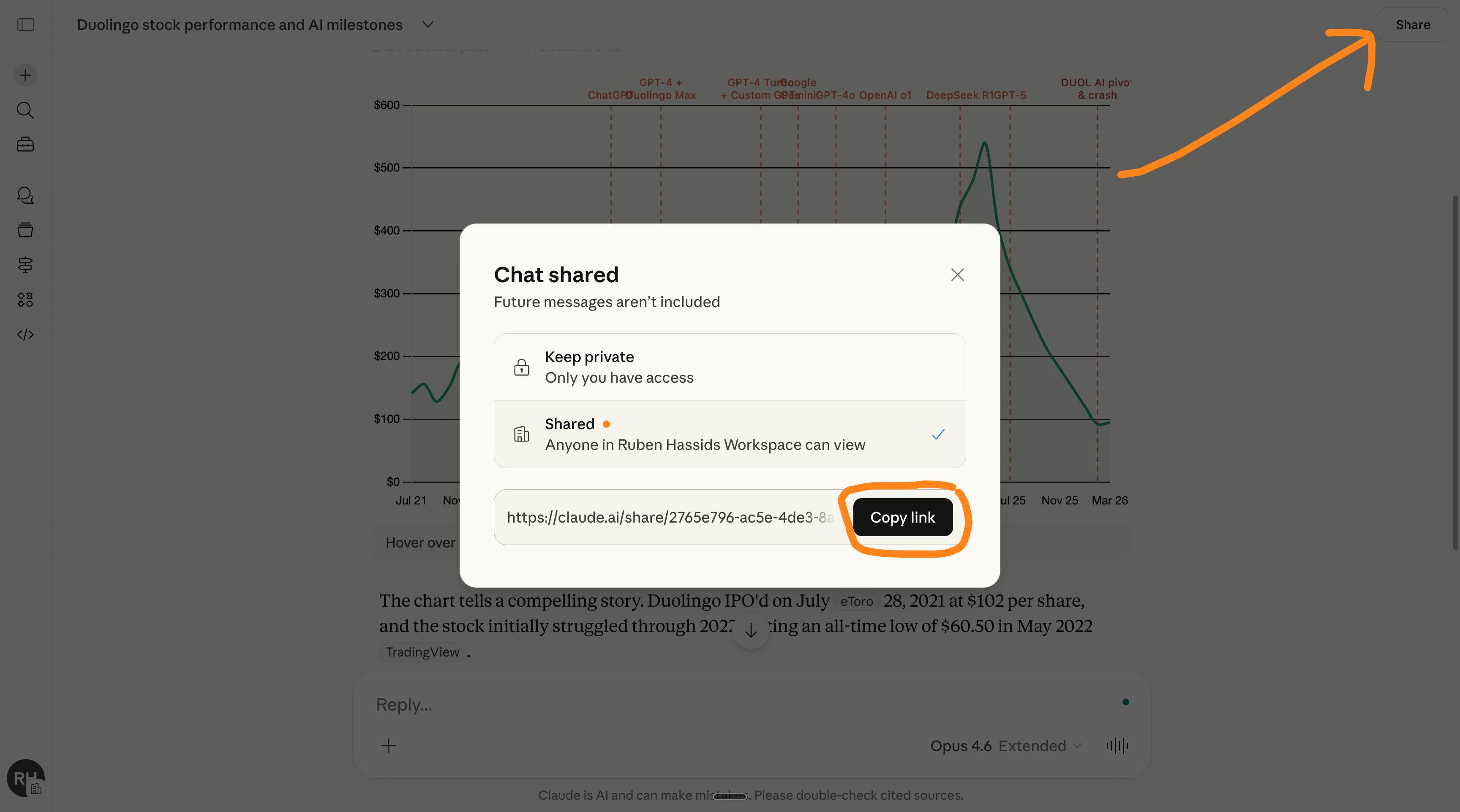
How to share it with your client
You create an interactive chart with Claude.
You then follow up with this prompt: “I need to send it to a client. Code it.”
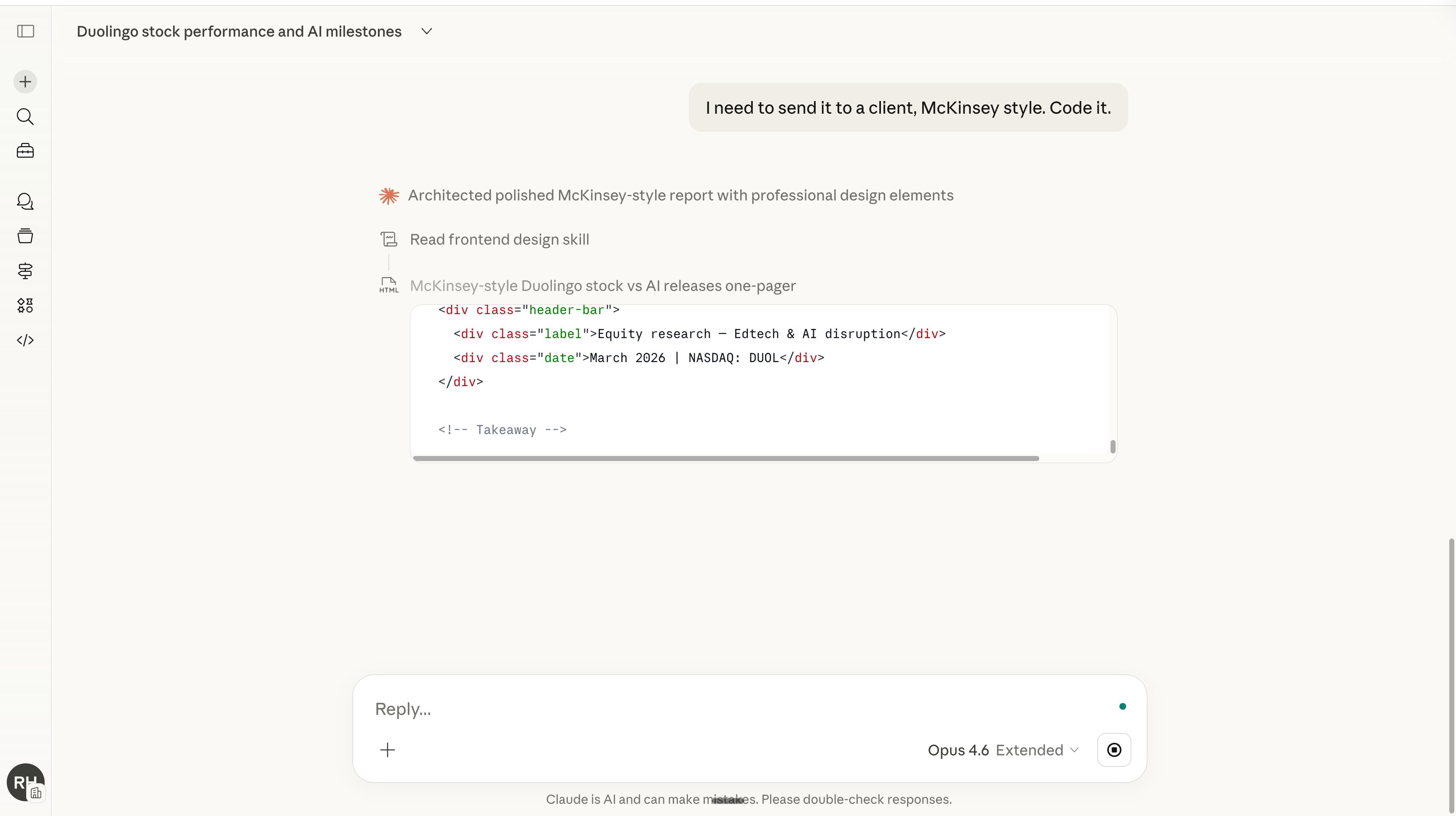
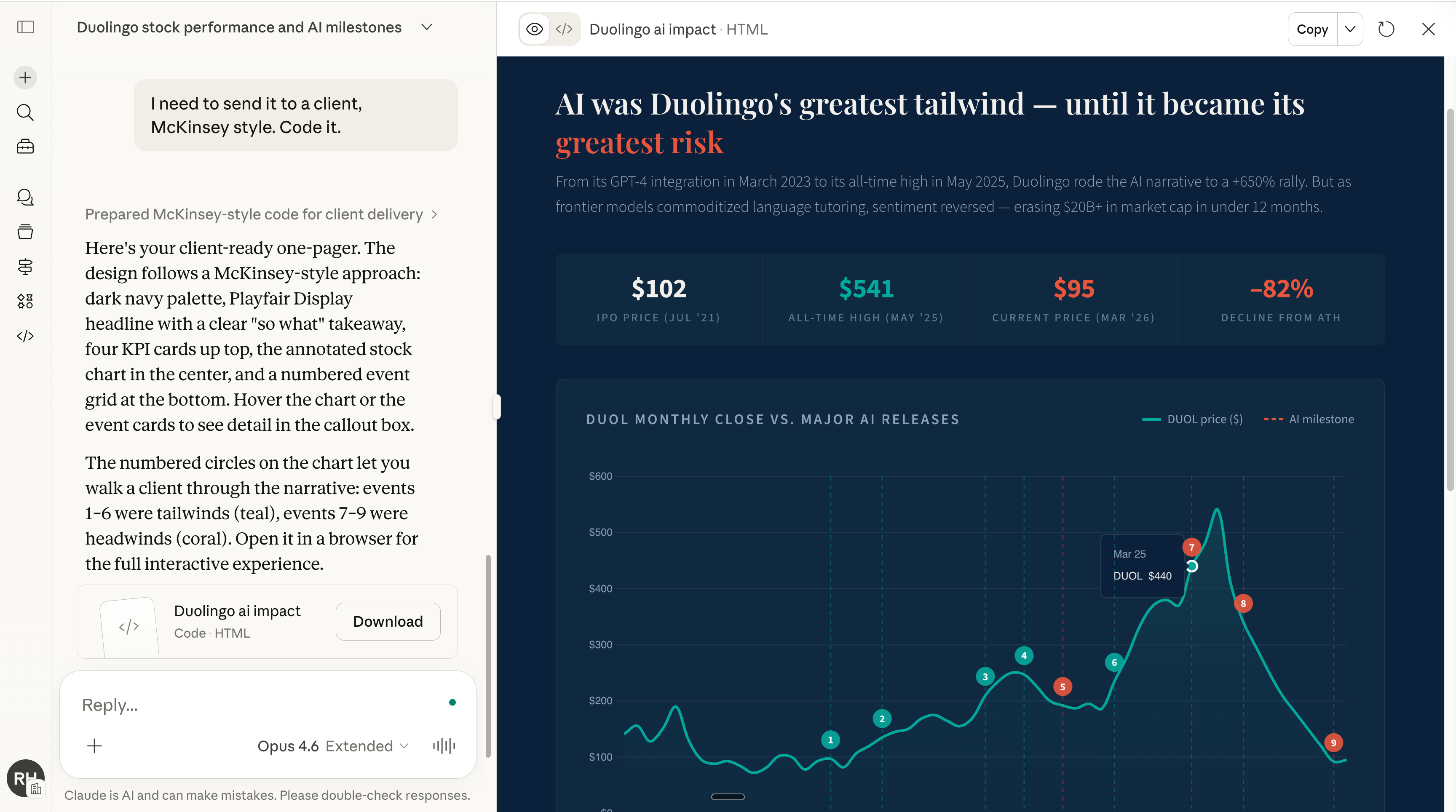
You can easily download it and share it. Like this:
💡 Pro tip: If you need to send a link, upload the html. (the thing you just downloaded) to a Google Drive, and send the link of that drive.
Be that person.
This newsletter is entirely free. I want to be the greatest filter to the permanent AI noise. And 366,000+ people read this twice a week to know what to focus on.
Some people came because of my LinkedIn. But most readers subscribed because someone they trusted sent one of my articles to them.
If this article helped you, be that person for someone else (and share it):
It does not cost you anything to share. And sharing keeps this newsletter free!
If someone sent you this, first thank them, and don’t miss the next guide by subscribing for free. Bonus point if you introduce yourself in the comment section.
I have been in the ERP industry for over 30 years.
Using Claude in my ERP work and the results are nothing short of amazing.
The interactive diagrams help clarify complex workflows and processes so teams can focus on doing real work that moves their business forward.
Claude code has been able to make those basic html graphs for a while. Whats new is the flow-charty *diagrams*, like figures for academic papers or articles, where one might otherwise go for excalidraw