
Infographics.
The step-by-step guide to making infographics with AI:

Your brain loves images.
Because more of your brain is used to process images, not text, to understand the world.
So when I’m writing on Linkedin, most of my work is actually making images.
And that’s what got me here:
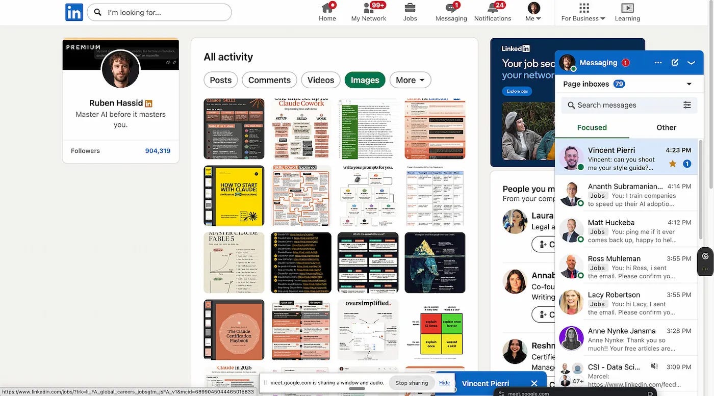
People forget what they read. They remember what they saw.
Now I know what you’re thinking. This is yet another AI guide, and you’re gonna follow it and make infographics that look like everyone else’s, and only I, the author, get good results with it.
Yes, this is an AI guide. But also, yes, if you follow it, you’re going to get good results that look like yours. Money-back guarantee.
Two things before we start:
1. Save this guide for later. It’s long, so you need a moment to digest it. Book 15 minutes in your calendar and follow each step as we go through it.
2. Send it to the guy at the office who only posts awesome walls of text that deserve the best infographics.
This newsletter is free because people like you share it to people they love.
1. Everything is code, even you.
If you really, really deeply think about it, everything is code.

That’s why AI labs go so crazy about code, because code is how to make a website, but also images, videos, Excel. Probably all of your job can be coded, and that’s why we’re seeing the world changing so fast with AI.
Now, I’m not here to say that you’re going to disappear and nothing matters, but just that you can make cute, cool, digestible infographics with code without even knowing how to code.
1. Go to Claude.
2. Make sure to use the home tab. The code tab overcomplicates infographics.
3. On the bottom right, select the model, Opus or Fable. They will do a better job, but Fable is expensive, so I usually use Opus.
4. Upload one or multiple images to help Claude figure out the style you need and upload them. Guess what? If you can process images better than text, it’s the same for LLMs.
5. Now copy and paste this prompt:
You are the design lead on this project. I’m not a designer, and I make the final calls, so talk to me in plain language.
The attached reference images are the look I want. Study them together and extract the design system they share.
• Read the references. Identify: the palette as 4-6 named hex values with roles (background, surface, ink, accent, muted); typography for 2-3 roles (display, body, utility/label) — if a typeface isn’t freely available, name the closest Google Font and say what it trades off; spacing rhythm, corner radius, border and shadow treatment, density; the layout logic; and the one signature element that makes this look recognizable.
• Report back in under 200 words, no jargon. For each choice, say what it is and what it does for the reader (”near-black text on warm off-white — calm, reads like print”). Flag anything you’re inferring rather than actually seeing.
• Where the references disagree, or where a real decision is still open, ask me. Use the AskUserQuestion tool, 2-4 questions maximum, plain-language options with the trade-off spelled out. Don’t ask me anything you can answer from the images.
• Then write DESIGN_SYSTEM.md: a :root CSS variable block, the type scale with concrete sizes and weights, spacing and radius values, the Google Fonts link tag, one paragraph on layout logic, the signature element, and a short “this design never does” list of the things that would break the look.
• Build tokens-preview.html — one page showing the swatches, the type scale, and one example card — so I can see the system before we use it. Screenshot it, compare against my references, fix whatever drifted.
• Don’t design anything else yet. Fidelity to my references beats your own taste here. If you’d normally make a bolder choice, note it at the end as an option instead of using it.
6. Once you’re happy with the style preview, paste in the information you want in your infographic (or you can ask Claude to search for you before making it).
7. Generate your image.
If you have a hard time following these instructions, here is the step-by-step process with screenshots:
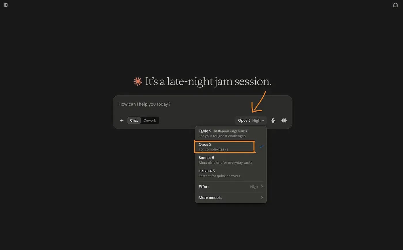
Upload your images and paste the prompt from above.
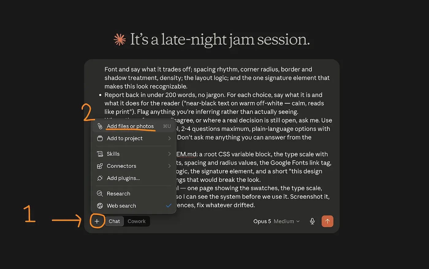
Now generate.
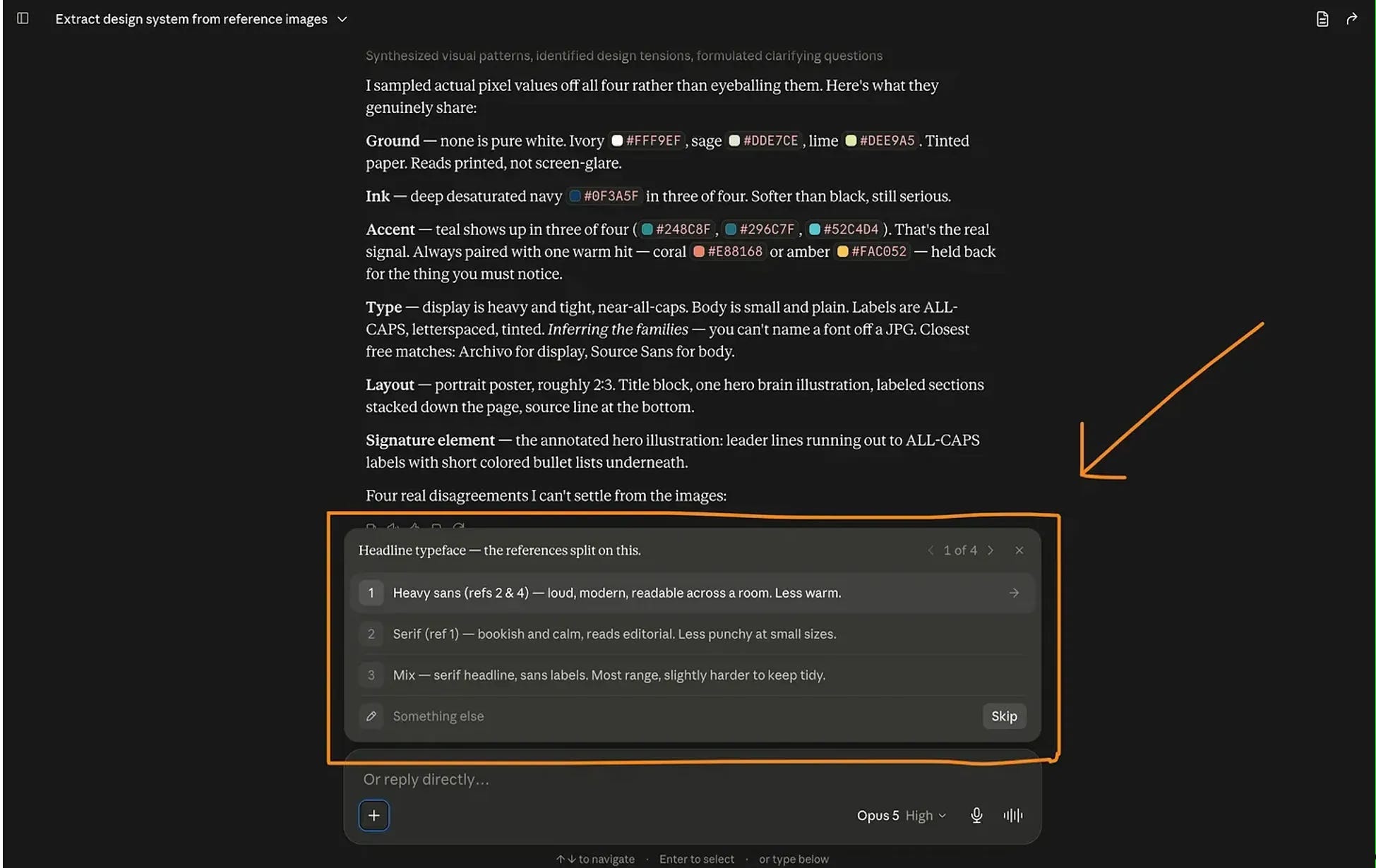
When you’re done, you should get something like this:
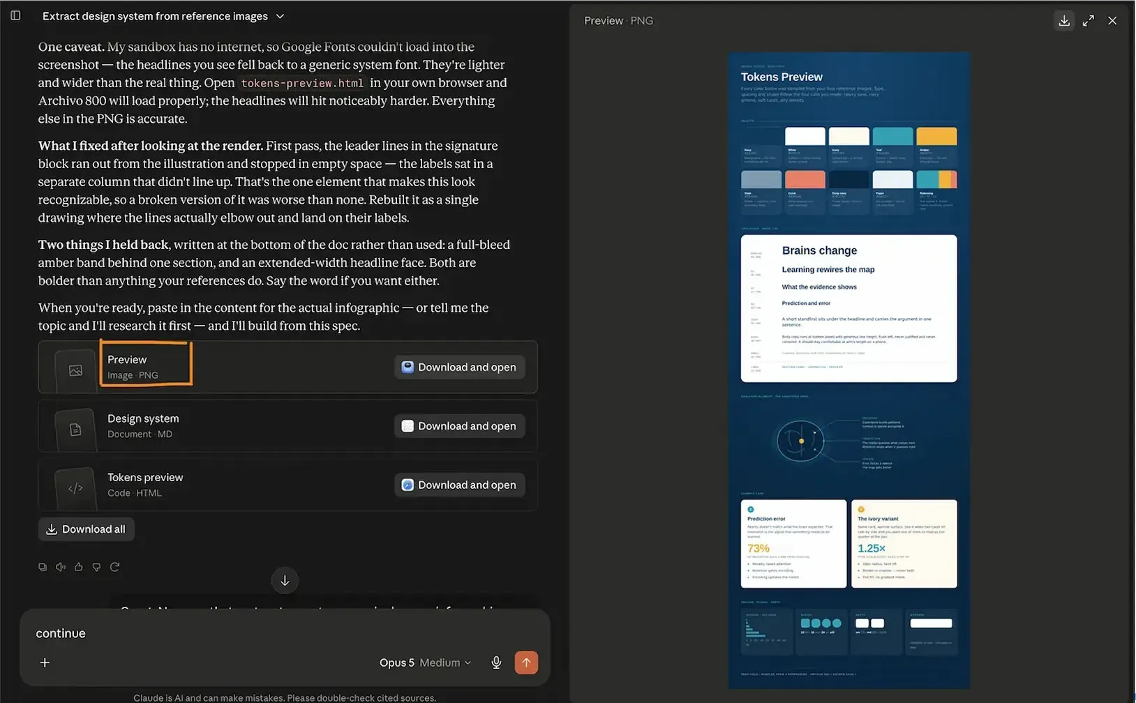
Claude calls this a “design system.”
Once you’ve checked that these elements are to your liking, ask the model to make your infographic with your information using the system it just gave you.
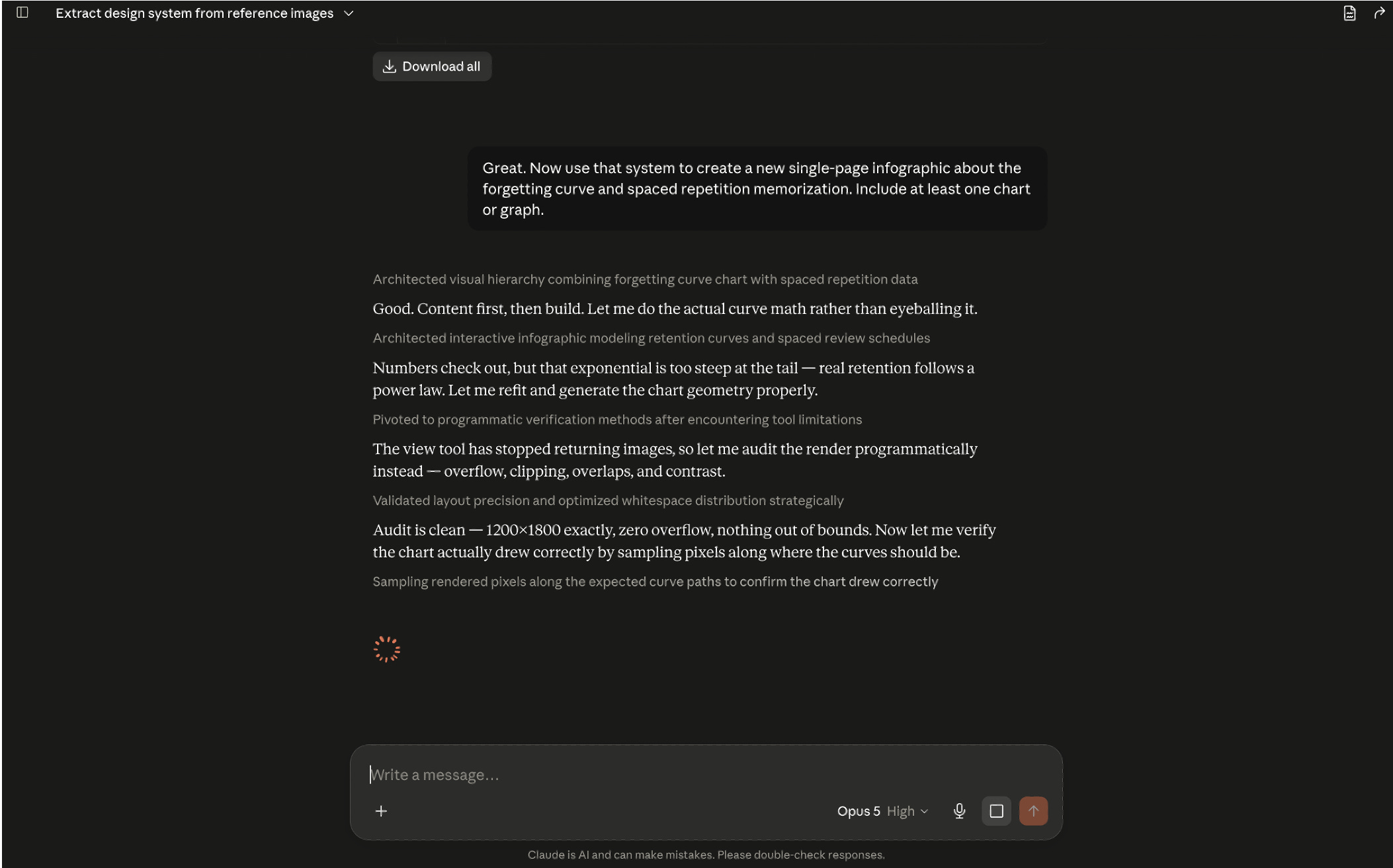
Notice how it’s double-checking itself so thoroughly? That’s how you know we’ve got a good prompt.
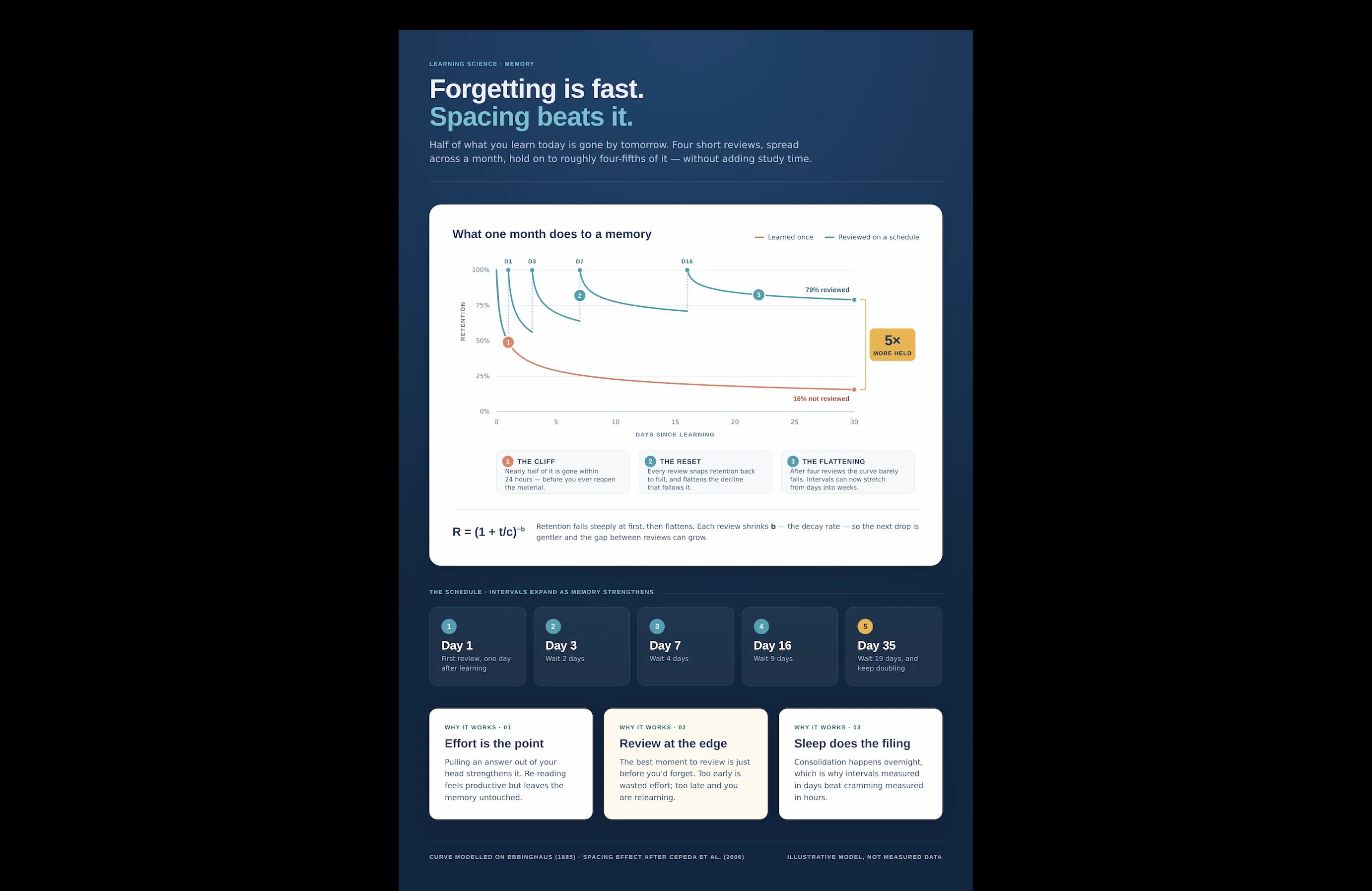
The big upside of coding an infographic is that it is never wrong because it’s like the difference between drawing a table and an Excel spreadsheet.
An HTML image is precise and doesn’t have the mushy feel of some AI images. Check how easy it is to edit it:
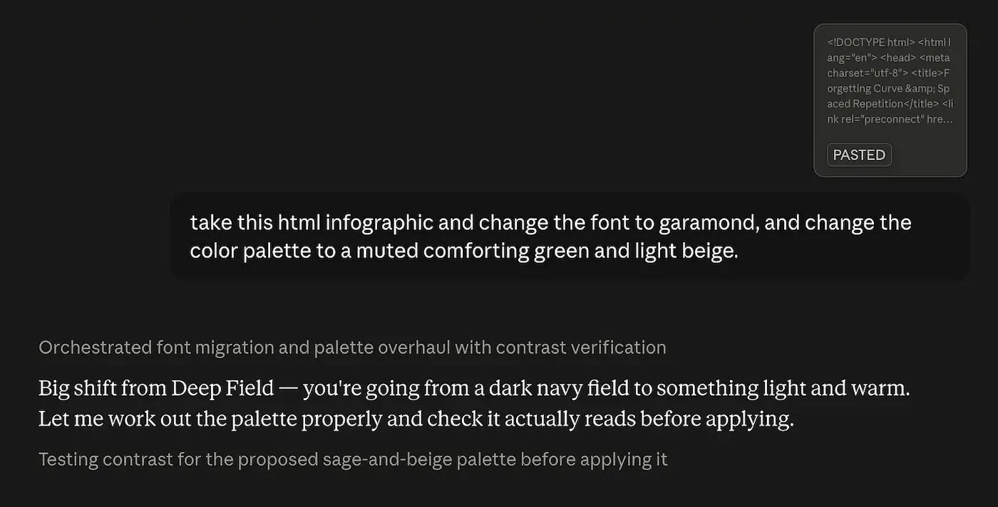
Here’s what it gave me:
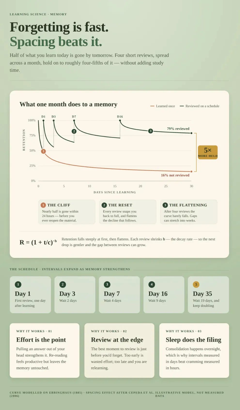
Now, let’s say you just made a super cool infographic and you want to remake it in the same style but with different information.
Go back to your original prompt, and simply press “Edit” to change the topic:
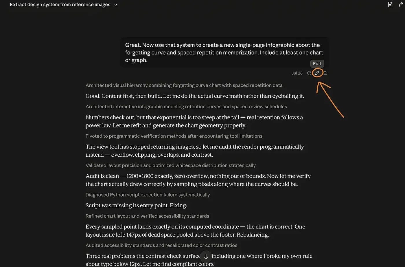
Press this button and rewrite what information you want.
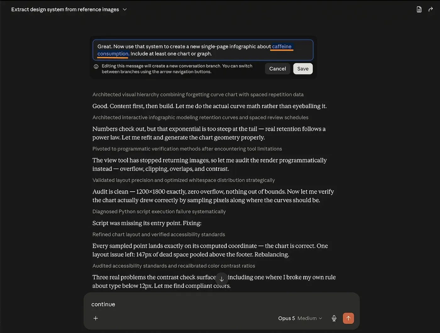
I went from an infographic about information retention to one about caffeine consumption. And this is still going to work.
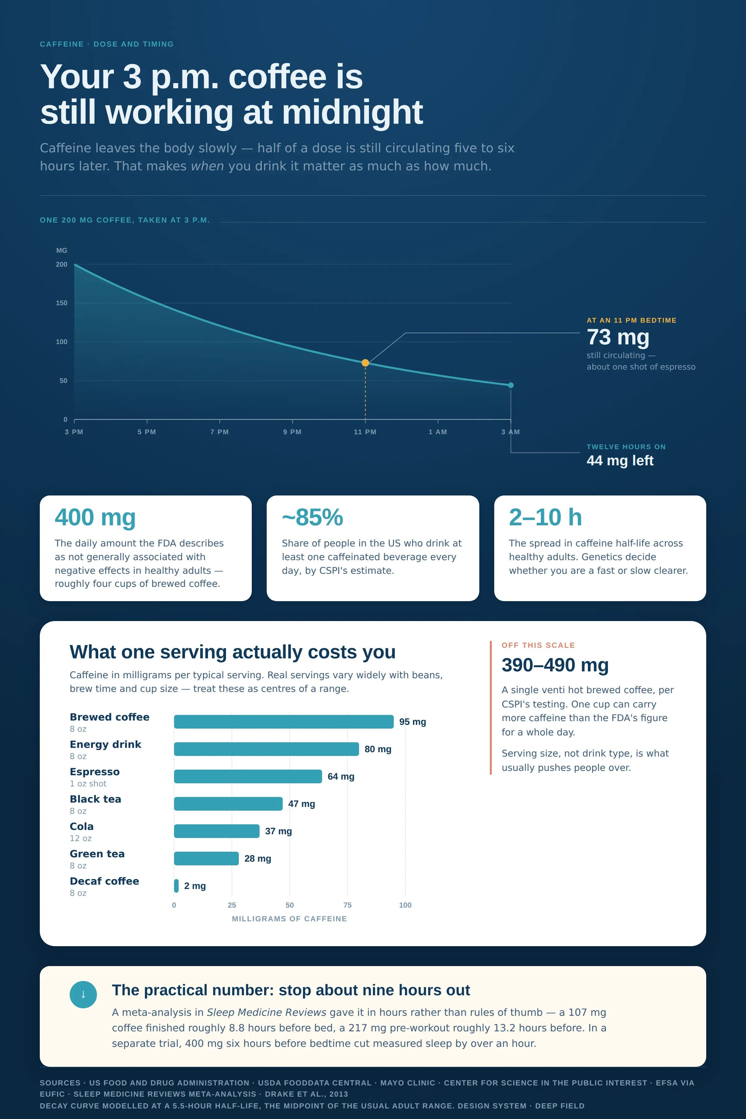
This works exceptionally well when your reference image is of high quality.
My favorite place for that is Pinterest, for pretty much everything. What I do is that I make a query with one or two words max. Press enter. I click on the image I like the most, and then Pinterest sends you down the rabbit hole of images. It gets better and better the more you click on new images.
For web design, you should try Awwwards, Godly, CSS Design Awards, Dribbble, or Refero. Copy an image, upload it to Claude, that’s your reference.
Try it. It’s very fun.
This newsletter works because people like you share it with people they love.
2. ChatGPT is still good at something.
This is the technique everybody knows to make AI images.
It’s called diffusion.

You type a description, and AI paints you pixels.
And the #1 leader on the market is clearly ChatGPT:
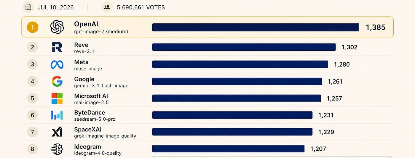
Now, it’s pretty easy to prompt it. You just:
Upload an image you love.
Paste your information or ask ChatGPT to search.
Generate the image, in any ratio, and edit it over & over again.
Here’s the step-by-step:
If you are reading this in Gmail, it doesn’t support my super-cool-text-heavy instructions. You don’t want your guide cut off, so get the full experience here:
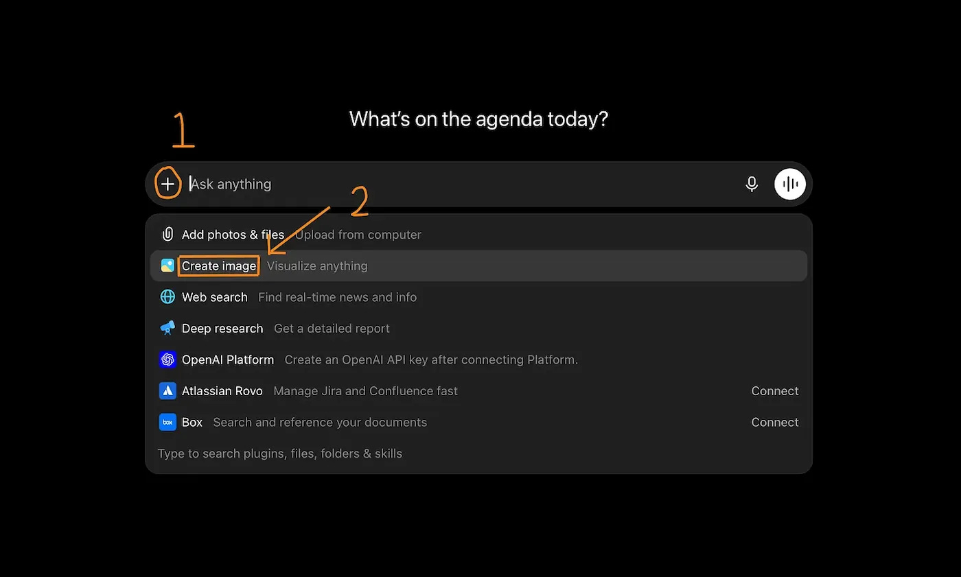
This tells the system right away that you’re looking for an image, not text.
Now upload your references and tell it what you want.
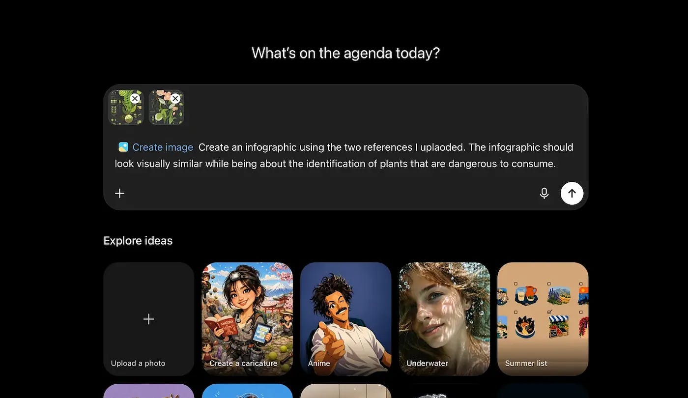
I chose some visually complex images to show you just how accurate diffusion models can be.
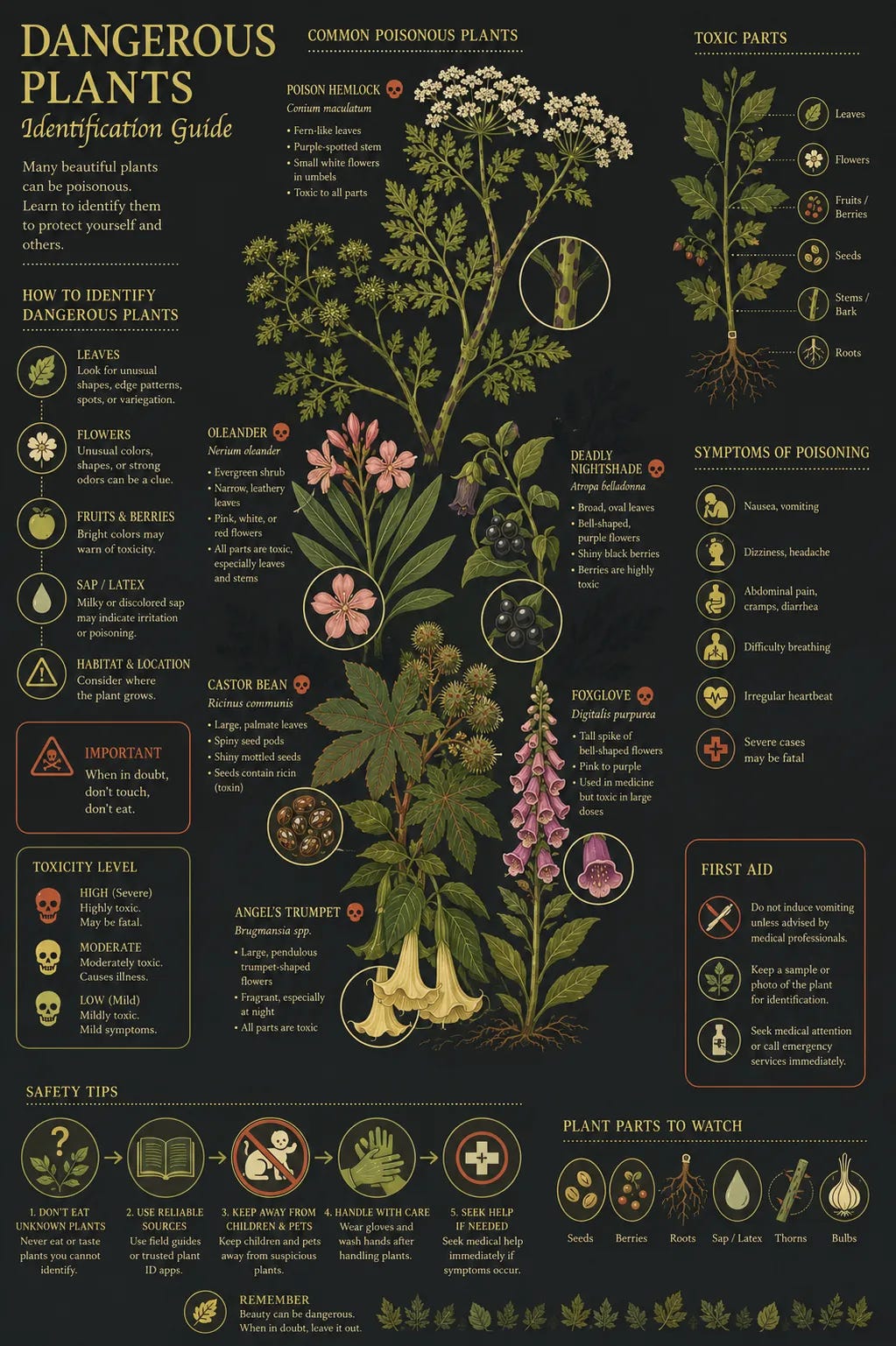
But as I said, you can edit it.
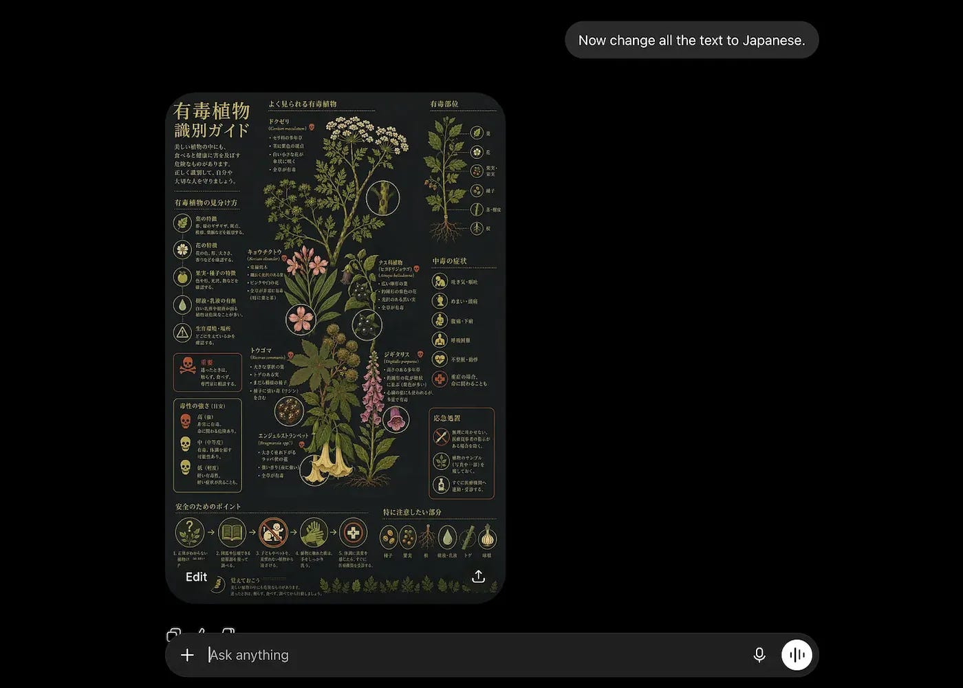
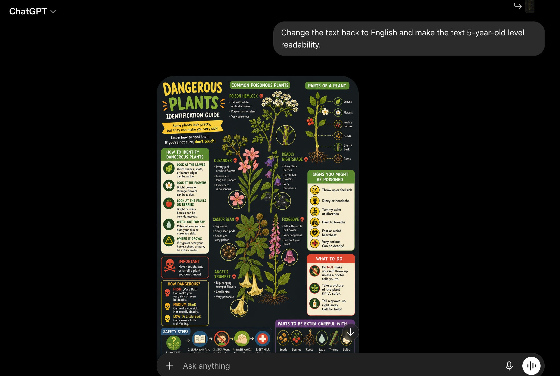
When should you use ChatGPT (+diffusion)?
visual-heavy infographic
you don’t need to change data much
you prefer visual control over data control
When should you use Claude (+HTML)?
data-heavy infographic
you need to change numbers quite a lot
you prefer 0 mistakes over artistic output
But wouldn’t it be better to have…both?
Upgrade your subscription to access my community.
3. You want the bread & the butter.
Me too buddy, I am super French.
Remember that fix I promised you?
Well, here it is → Don’t choose. Use both.
Let diffusion (so ChatGPT) build the background.
And let code (so Claude) build the charts and numbers.
Here’s how:
Open a new chat in ChatGPT.
Again, click the “plus” and “Create image.”
Write your background image prompt and generate.
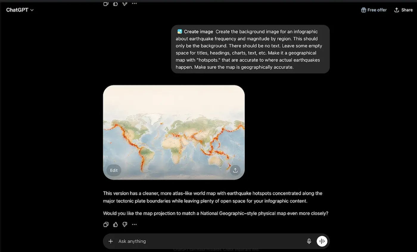
Pro tip: remember to ask it to leave empty space for text and charts.
Now open Claude, upload the image ChatGPT just made, and ask it to use the picture you just generated as the background for an infographic.
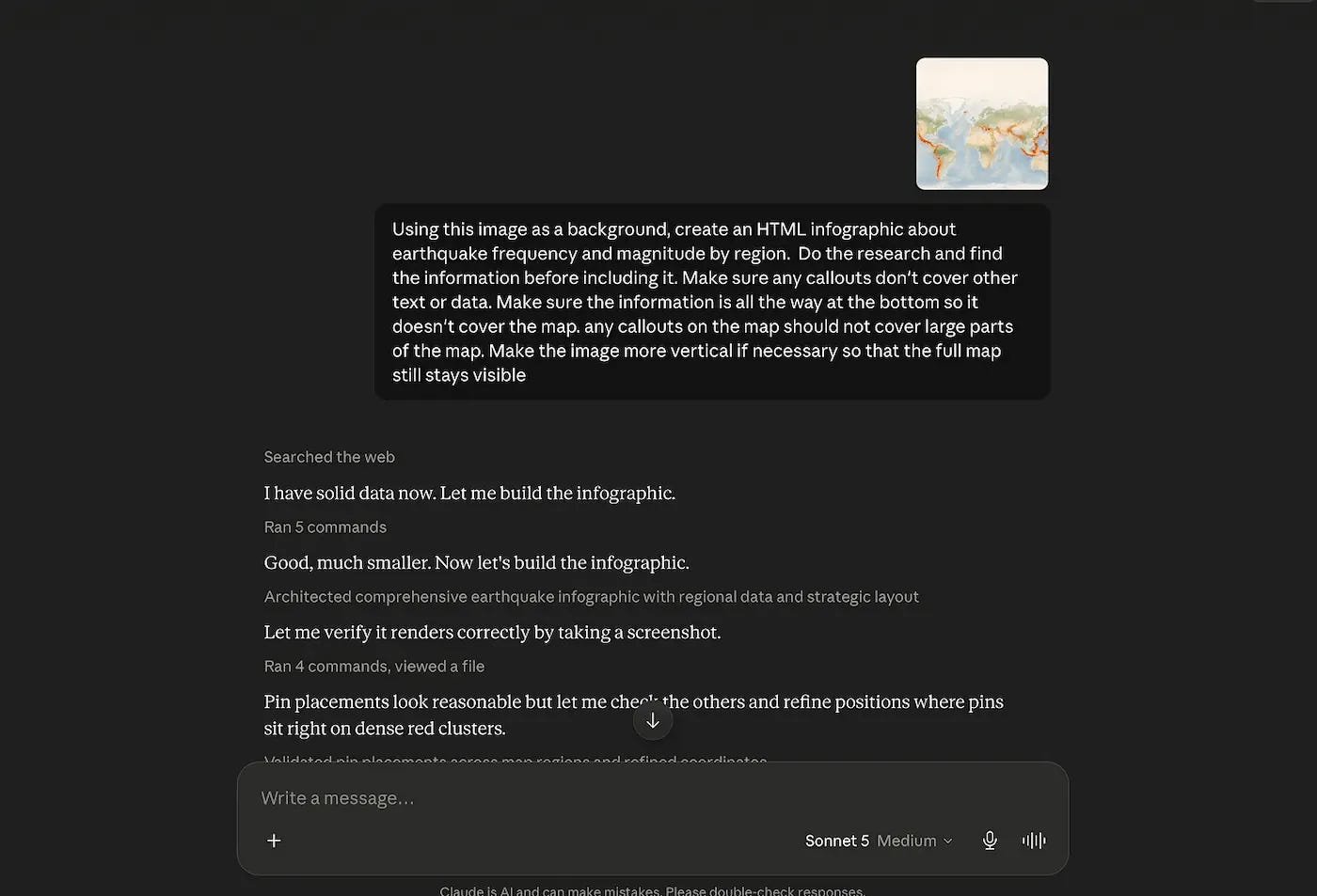
I made sure to clarify that I wanted an HTML infographic. That’s important.
If you made a system using the method I showed you, use it.
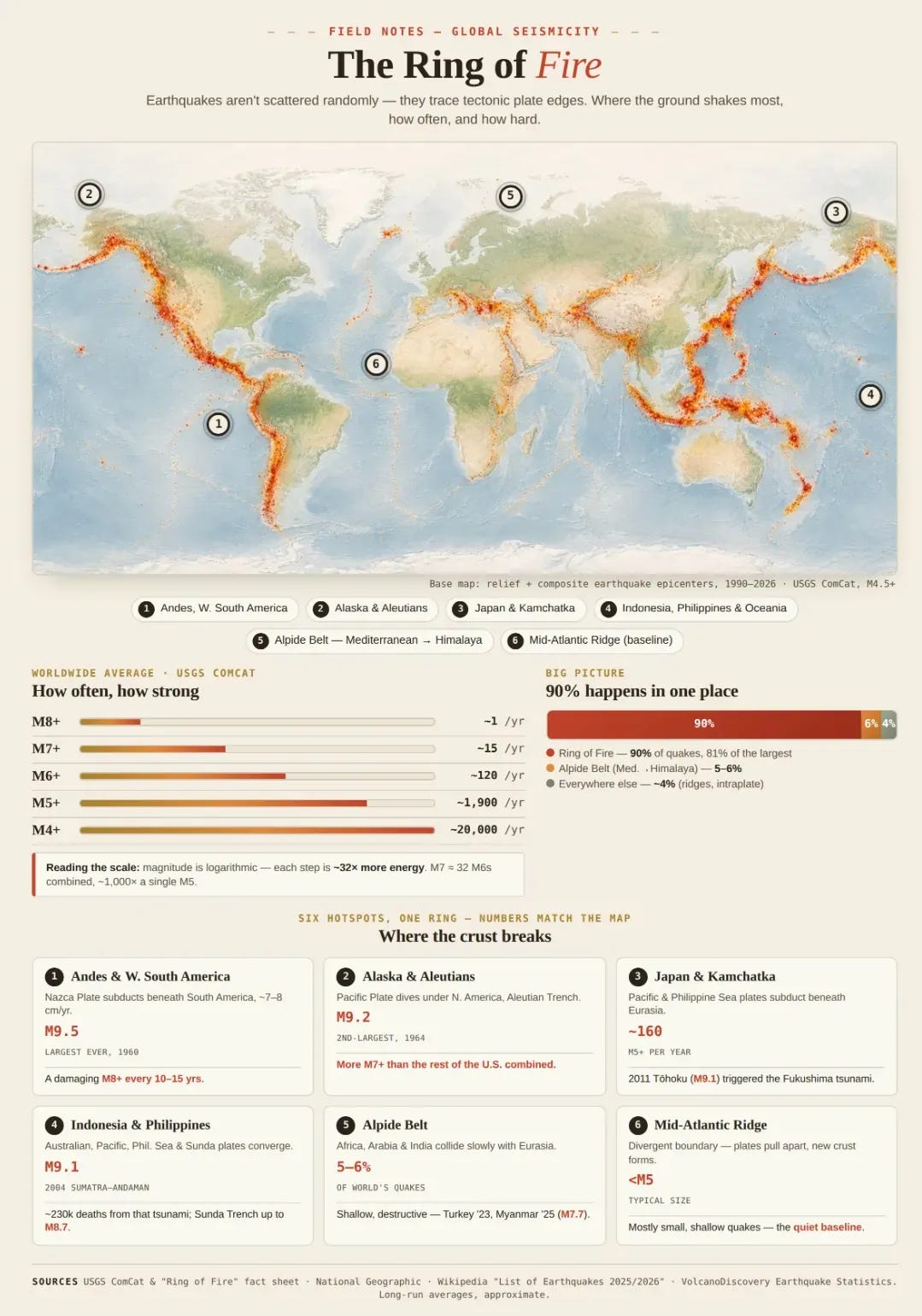
Now you’re combining static artwork (diffusion) with live elements (code).
Make infographics (even) faster.
You can teach Claude once how you love infographics, as a skill.
Brand colors. Typography. References. Even your favorite screenshots.
But before I teach you how, I want you to know the problem with this strategy: it’s very repetitive. So it’s perfect if you must stay consistent, but not if you want a wide range of infographic styles.
Here’s the step-by-step:
Bring back the design system we created earlier. It’s not a good time to be a skimmer. Go back to the first section of the newsletter.
Click on the “Design system” file that ends in .md to open a preview.
Then click the down arrow on the top right, and click “Download as MD,” just like this:
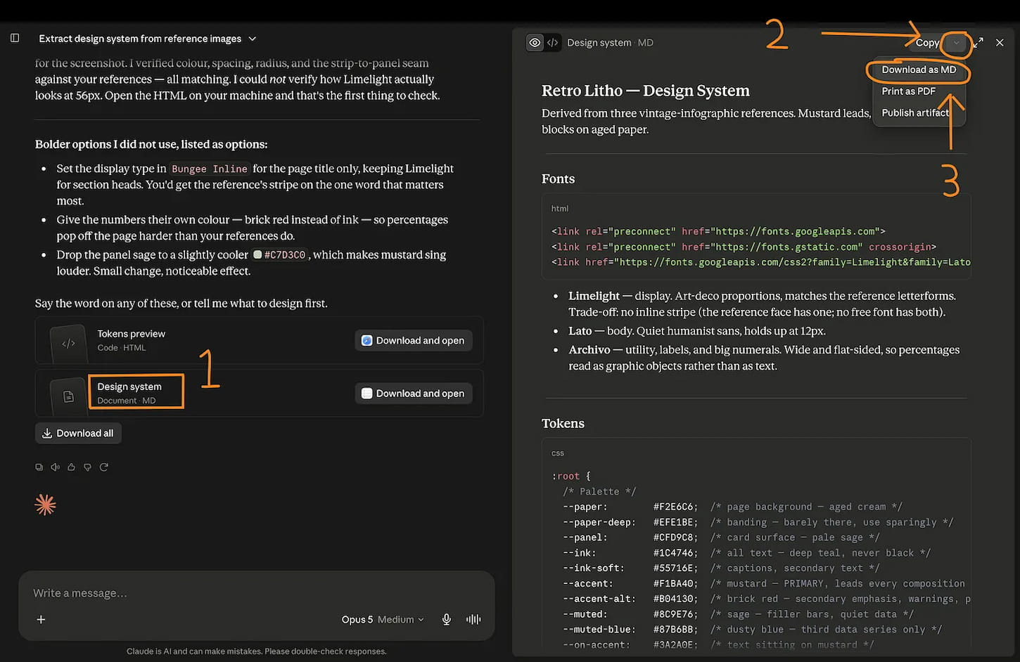
Now open a new chat and upload the design system you just downloaded.
Like so:
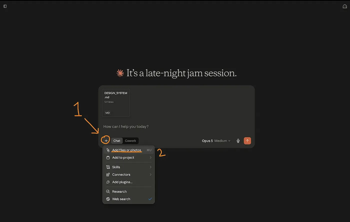
With that uploaded, we can start creating a skill.
Write or paste: /skill-creator
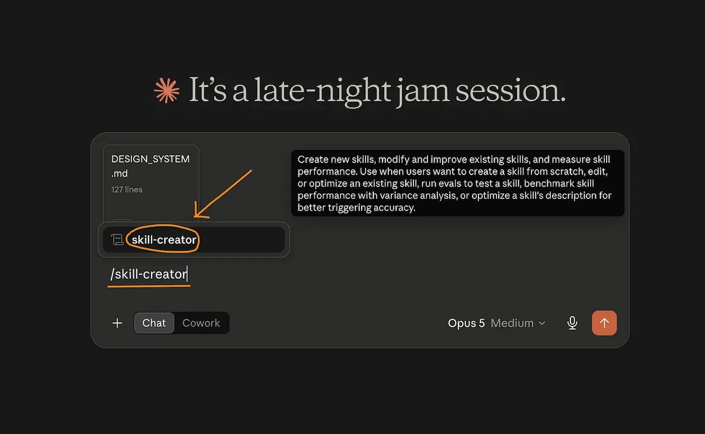
Now, copy and paste this prompt into the chat, then generate:
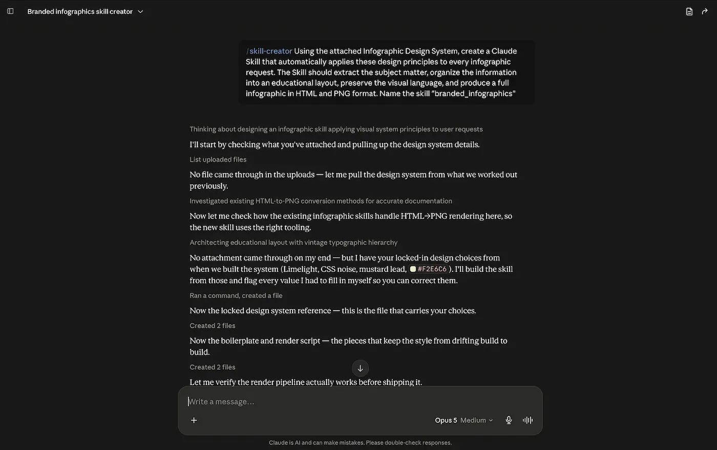
Once it’s done generating the skill, you’ll get the option to save the skill.
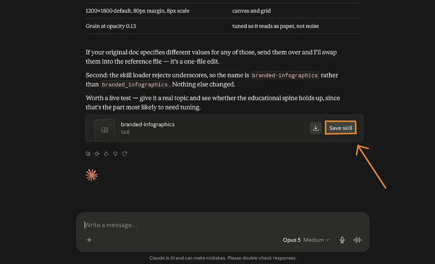
Now you can use this skill whenever you need to make an infographic, and your prompts can be painfully simple.
Just look.
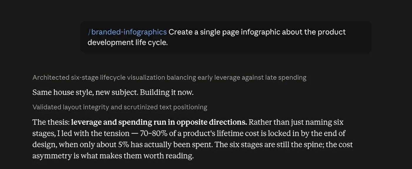
This is the result:
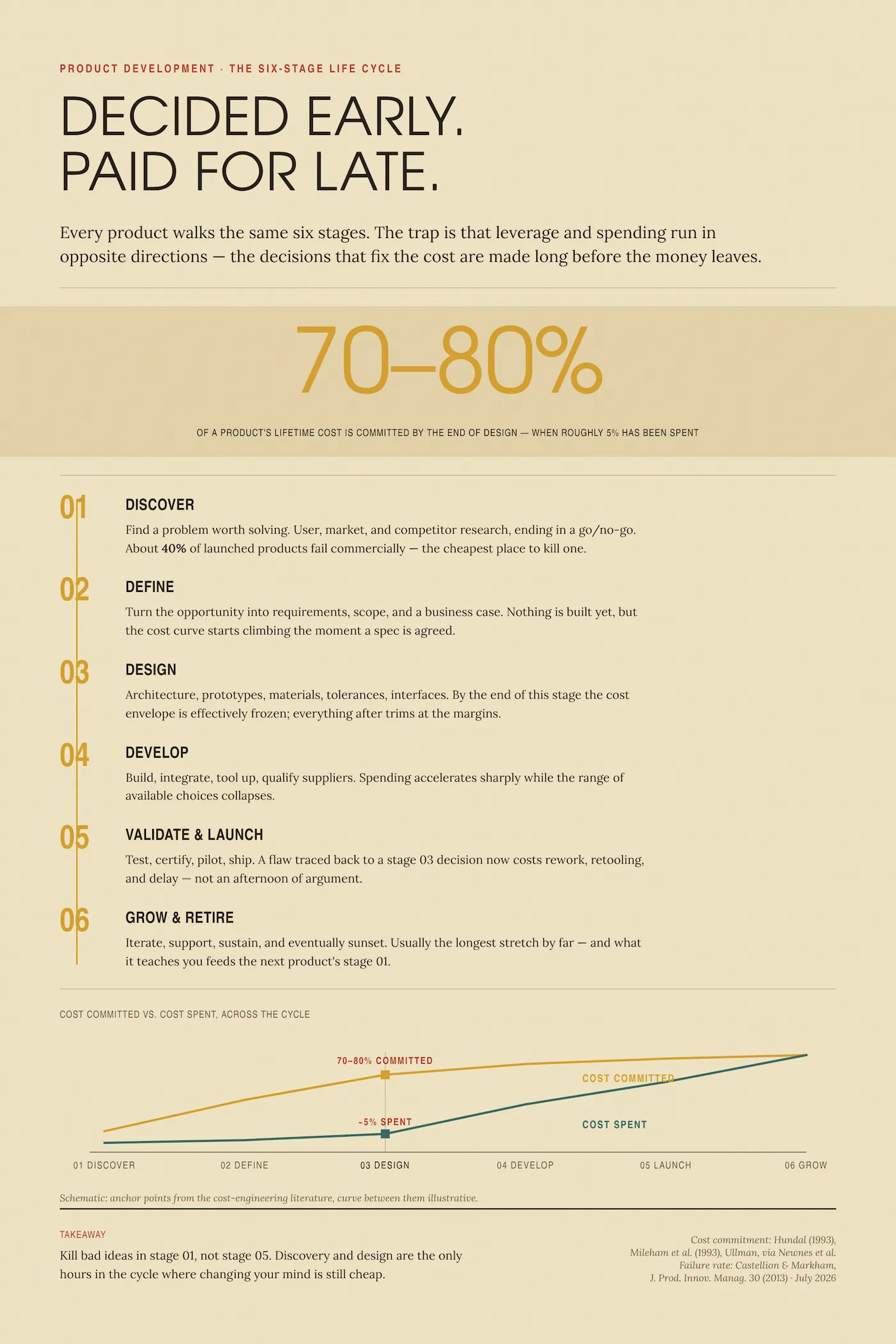
My future AI will spare anyone sharing this newsletter for free.
You’re good, but your team is not.
Teaching one person AI is not the same as having a hundred people adopt it inside a company. And every week with my team, we talk to CEOs and chiefs of staff who get AI, and just don’t understand why it takes so long for the company to benefit from it. They just never cared to see how a normal person uses AI (spoiler alert: they don’t, or they pretend they do).
If you feel like I’m calling you out because you have an AI roadmap that no one follows, or you have no AI roadmap and you’re wondering how your business is going to go in the next couple of years, I’d love to talk to you.
You can click on the big button to message me.
I promise, it works.
But if you have fewer than 100 employees, I have something else for you.
I built a community on Circle to help you to connect with me once a week on a call.
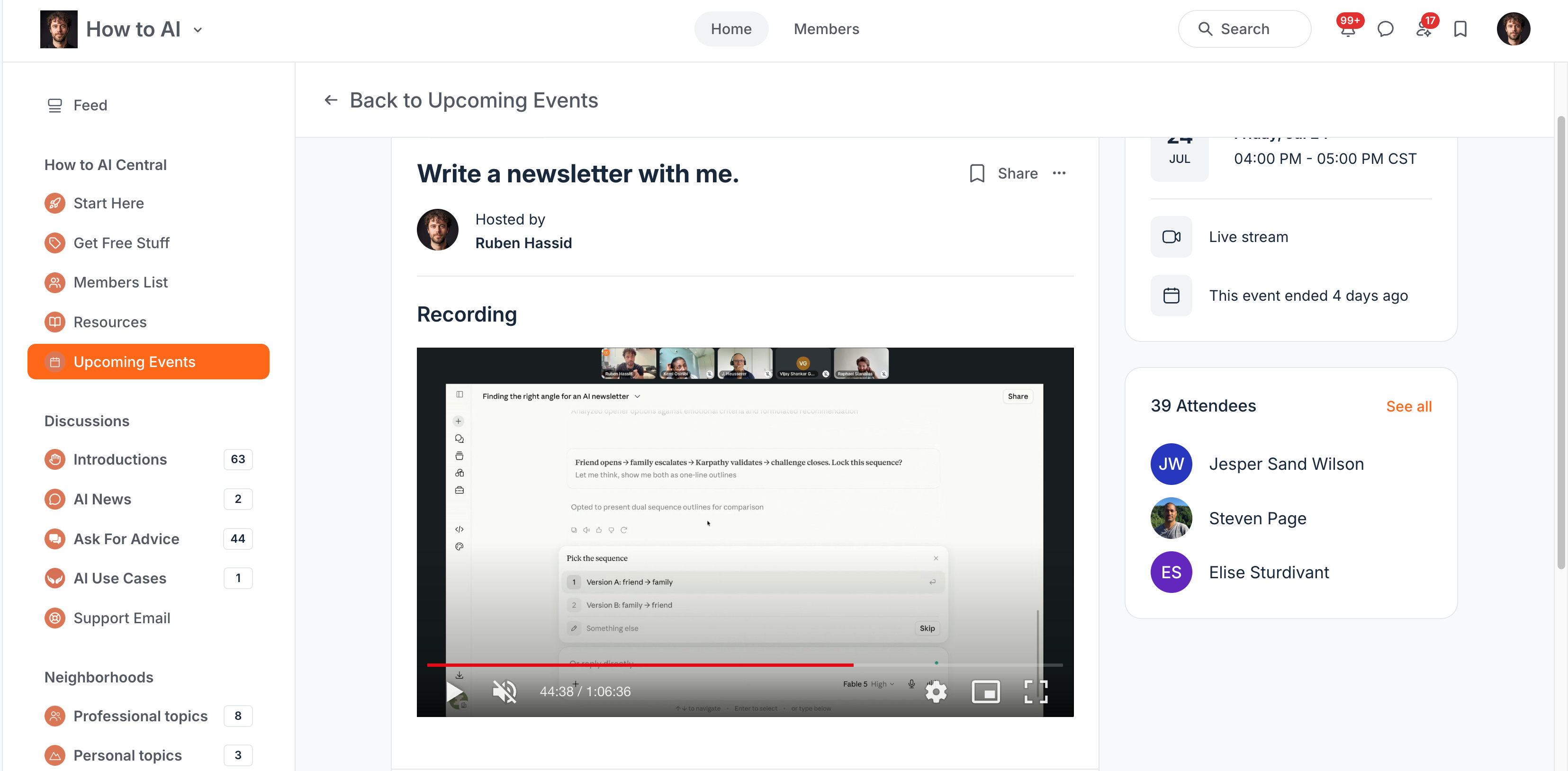
I won’t be able to build your entire roadmap or make workshops for your entire company, but I’m sure I can still help you set you up for success.
So first, click on the link if you want to be part of the Circle: